the project
Natalie from Page Beauty Therapy came to us as a start-up business in need of everything – logo design, web design, signage and print. While Natalie had years of experience in beauty therapy she was just starting out as her own boss. Creating a brand, website and printed materials was a new experience, as was working with a design agency.
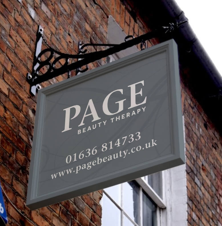
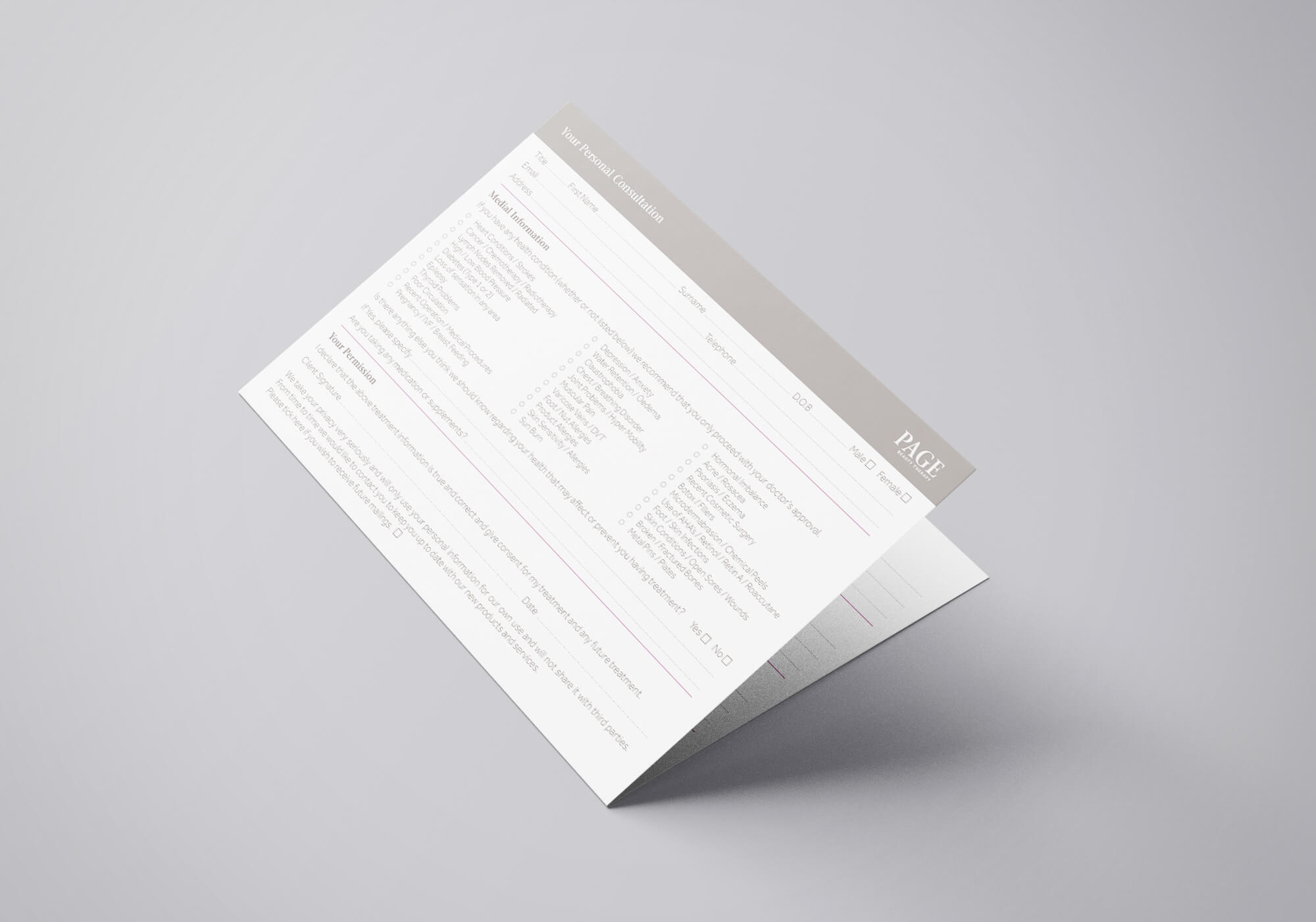
She was looking for a clean, neutral brand and a website that would highlight the products and services they have to offer, and an obvious link to their online booking system was essential. The branding and logo needed to be applied to the signs for her new premises as well as printed items – appointment cards and treatment plans.
our approach
The consultation process was key to this project. It was important to spend time discussing Natalie’s plans for her business, what she needed immediately and her aims for 5 years time. We needed to make sure the branding was versatile enough to be future proof and the website capable of expanding and increasing functionality.
We had to establish at the basics – design likes and dislikes. Natalie had done her research and had a clear vision for the feel of the website design. We wanted to know what she was hoping to achieve through the website – showcasing her talents, providing price and services information, allowing online booking or selling products – or a mixture of all three.
It was important to determine where and how the logo was to be used – was this just on the website, did she have a social media presence, what printed material was required?
the results
logo design
The logo was to be text based, mixing serif and sans serif fonts. There needed to be a primary and secondary version of the logo to allow it to be used on the website, on signage and on social media.
We supplied the logo in formats to use online, in print and on signage.
web design
Though the consultation we were able to suggest additional functionality for the website and offer advice on future development. We were happy to adapt the design based on the feedback from Natalie.
The result is a stylish, calming site that is easy to navigate and that the client is confident to edit.
branding
As the brand was to be applied to signage and print, as well as online, we created two versions of the logo. The greater flexibility worked well as the shop front sign was landscape while the hanging sign was square.
Brand guidelines were created. We applied the chosen colours and fonts to loyalty cards and client treatment forms, advising on the best paper stock for each item.


